 Support Site
Modal Module Help Guide
The Modal module can be used to set up popups that open on a page when it loads, or when a user clicks a specified button or link. Unlike annoying popups of the past that opened in a new window/tab, these popups are part of the page, only hidden until they are called. This prevents popup blockers from blocking them.
Modal popups can contain anything* a page can contain: widgets, forms, links, images, etc. They are an excellent way to include a form on a page without lengthening that page when launched at the click of a button or link or to be sure to grab your user’s attention when launched on page load.
*Note: certain restrictions apply when using videos in a modal popup, please see the section under Creating or Editing a Modal Popup > Videos in Modal Popup Content.
Modal popups are not meant to be a replacement for the External Links Warning.
Pro Tip: use modal popups sparingly, especially the ones that load with the page. The fewer you have, the more impact each one has.

When you create a modal popup, it can be set to launch on page load or load via a button or link, or both, and used in multiple places. Buttons or links can be placed on pages or in regions (but not inside another modal popup).
To create a new modal popup, click the Add New Modal Popup button above the list of Modal Popups.
To edit an existing modal popup, click the Yellow pencil icon button in line with that item.
Whether you are adding or editing, you will see a form with the following fields.
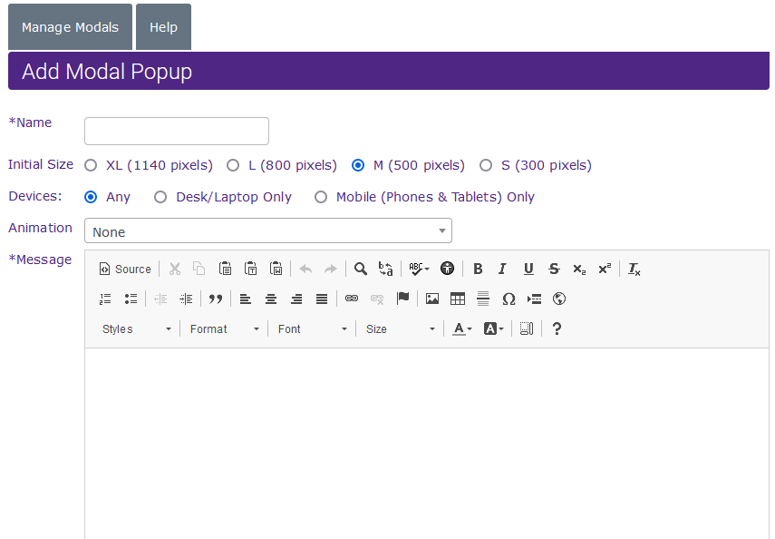
Name: Name your modal popup. This name will not appear on the website.
Initial Size: This will set the maximum size the modal popup will be. Smaller sizes are ideal for smaller content. On smaller screens, the modal popup will fit the window no matter what the initial size is set to.
Animation: You can add animation to the entrance a modal popup makes when it is launched via a button or link. This does not apply to modal popups which launch with the page (because the load is simultaneous).

Content: Content can be added to a modal popup in the same way as it is added to a page or Sidebar Content Item.
Note: You cannot add a button/link to launch a modal popup to a modal popup.
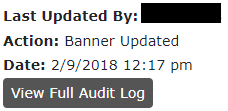
Modal Audit Log
The Modal module also contains an audit log displaying the most recent user that edited that modal and when this was done. Clicking the View Full Audit Log button will show you when all edits have been made and who made them.
Views (impressions) for page load mobiles are tracked and can be found under Reports > Pages & Module Tracking Reports
Click-on modal popup launchers (buttons/links) should be tracked via Google Tag Manager (GTM).
Technically speaking both of these are buttons, but the “link” version is designed to look like a link and is easily used inline with text. Using a button to launch a modal popup is better practice for ADA than using a link.
To add a modal popup to a page, click on the [Insert content] button below the editing window and choose Modal Popup from the list.
To add a modal popup to a region, you will need to create a Sidebar Content item first and add the Modal Popup button/link to it in the same way you do for content, and then add that to the page(s)where you wish it to appear.
Once you choose Modal Popup from the Insert Content list, a popup window will appear.

Modal: Choose the modal popup you wish to use.
Text: This is the text that will appear on the face of your button/link. For best SEO, ADA compliance, and user experience, make it informative. Use labels like “Apply for a Vehicle Loan” not “Click Here.”
Link or Button: Should this be a button (styled the same as all the buttons on your site) or a link (styled like your text links)?
Pro Tip: Buttons work best on a line by themselves; links are best used in-line with text.
Once you have made your choices, click the Insert Code button.
These popups load when the page does, obscuring it until the user clicks the X or close button to remove the popup. Like Alerts, Modal popups can be set to show every time the page loads, once per session (visit) or never again after being closed.
Modal popups that are launched when a page loads are set up when the modal popup is created or edited.

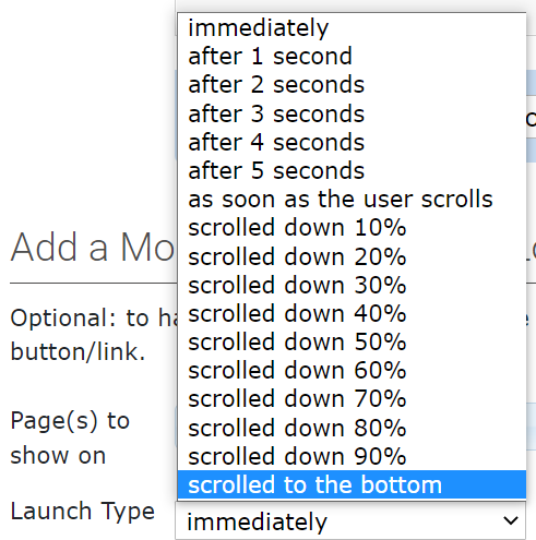
Page(s) to show on: Choose the page(s) you wish the modal popup to show on. See the example below.

Launch Type: Choose what type of delay if any that you would like applied to the popup. Can be based on time or the user scrolling.
Dismissal Type: Similar to alerts, you can decide how often the modal popup is shown after it is seen and closed initially by the user.

Show: Modal Popups can be set to live or preview. To preview the modal popup, set it to preview, choose the page to show it on, and then visit that page.
Start & End Dates: You can set the start and end dates ONLY for modal popups that are launched on page load. Leave these fields blank to start immediately and/or never expire.
Pro Tip: The start and end dates of button/link launched modal popups can be controlled by editing the page those links reside on and setting the publication date.
Previewing a Page Load Modal Popup
To preview a modal popup, make sure that the Preview option is checked off.
Go to the listing page and click the View button in line with the item. The page to which the modal popup is attached will open in a new window with the modal popup also open (visible). If the modal popup is used on more than one page, the first one listed is the one it will preview on. It will look and work the same on all pages to which it is added.
Note: closing this modal popup in preview will have the same effect as closing it would if it was live. In other words, if you have set it to never appear after being closed, you will not be able to preview it again.
Videos can be added to modal popup content, however, there are some restrictions. Videos will play when the modal is launched via button or link; page load videos will not play until the user clicks on them. Videos will pause when the modal is closed. If it is a button/link-launched modal popup, the video will start again where it left off when the modal popup is opened again.
Do not add more than one video to a popup.
The playback of external videos (YouTube and Vimeo) will not be started/stopped by opening and closing the modal popup window.
Pro Tip: Do not have more than one on-load modal popup per page. Overuse of modal popups will drive users off your site.
If you have more than one modal popup loading automatically on a page, you will see a warning at the top of the listing. Ensure that these modal popups do not have overlapping timeframes.

You can have any number of buttons/links to launch modal popups on a page, either for the same content (i.e. a loan app) or different content (i.e. rates tables for different types of loans, credit cards, or savings accounts).
The list of modal popups includes these fields: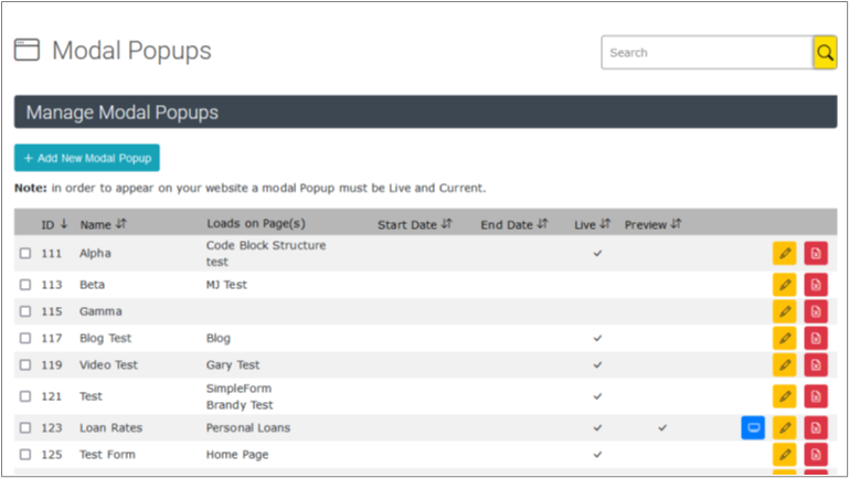
- ID: The Id number of the modal popup.
- Name: A name which you have given the modal popup for easy reference. This will not appear on the website.
- Loads on Page(s): The page(s) on which the modal popup will appear, when the page is loaded.
- Start/End Date: The dates on which the popup starts and ends if set.
- Live: Whether the popup is currently in use (also dependant on start/end date).
- Preview: Whether the popup can be previewed in place (not dependant on the start/end date).
Action Buttons: Use these to preview, edit or delete modal popups.

Modal Popups
Pros:
- Attention-getting
- Can contain larger and more varied content, such as forms, rates, and tables.
- Users must engage with them (to close them if nothing else).
- Can be launched when needed, via a button or link.
Cons:
- Blocks the content the user is after (i.e. may be annoying)
- Best practice is one per page
Alerts
Pros:
- Less intrusive (i.e. less annoying)
- Can have multiple alerts on a page
Cons:
- Users can ignore them
- Ideal for short content
- Content is limited to text, images, links, and Bootstrap and Font Awesome icons.
Before deleting a modal popup that launches with the click of a button or link, delete those buttons or links from your content. You can find these by taking note of the ID number of the modal popup and using the search at the top of the Timix to search for TAFTMODAL#[the ID number].
You will see a list of all the pages and sidebar content areas where the modal popup button/link is used.

To edit any page or item click the Yellow pencil edit button.
If the modal popup is only launched when a page is loaded, you do not need to edit that page.
After removing any launchers, you can remove the popup itself. Click the Red delete button in line with the modal popup you wish to delete.
A dialog box will appear asking you to confirm the deletion. Click OK to delete the item.